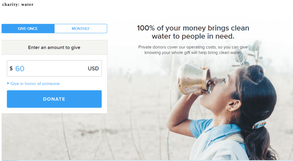
Your parishioners’ time is precious, and you want to make it easy for them to give; the number one way to do this is to improve your parish’s online giving form.
This week, evaluate your online giving form:
- How many fields do you require donors to fill out? Could you eliminate one or more?
- How many of your fields are required? Could you make any optional?
- Choose a co-worker who is unfamiliar with the donation page. How long does it take him or her to complete a donation? Are there any ways you could shave 10 seconds off that time by altering the layout of the page?
These may seem like small, inconsequential changes, but when you improve your parish’s online giving form, you make it much more likely that potential donors will finish the process and make a gift. Here’s a great example of a sleek giving form that requires you to fill out just four fields – donation amount, name, email, and credit card number. It takes just two clicks to give!

When looking at a page like this, it can be easy to think, “Hey, I need lots of information from this donor. Why not just ask for it up front?” Study after study shows that with every required field you add, you lose donors. You’re not annoying donors. Many just don’t have the time to fill out long forms without something else interrupting them.
One final way to test your form
Take a look at it on a tablet and a phone. Is the form still functional? Are there problems with the way its displaying? Last year we crossed an important threshold – more than half of all traffic is now on mobile devices. That number will continue to grow – is your online form ready to grow with it?


